
Chances are pretty high that a not insignificant part of what first drew you to heavy metal were the aesthetics and imagery associated with our beloved genre. Maybe you were a young lady raised in the church and age brought you disdain for that world, making satanic artwork a fear-laden fascination. Perhaps you were a nerdy chap who relished spending his weekends playing D&D with friends only to find that the paladins, wizards, and dragons on power metal covers further stoked your imagination. It could be you were a more theatrical youth and discovered a myriad of black metal covers with corpse paint, armor, and spitting fire to be the type of performance art you weren’t finding in other genres.
Regardless of what brought you to our world of weird, dark, and random, cover art played a part and deserves to be celebrated. We all know a record gatefold is the ideal format to pore over the details, but CDs, tapes, and even digital purchases provide us plenty of opportunities to see music as part of a more holistic art. Bands often put hours of time and substantial portions of their budget into finding the art best that represents their work to provide you an experience that tantalizes both the eyes and ears. Whether that art is silly, chaotic, simple, gory, pretty, or any other adjective, it was likely brought to you with intention.
Best of all, the vast majority of fans know this and focus on quality cover art. We seek out opportunities to take it beyond just an image. We sport it on shirts and hang up posters or put a record into rotation on shelves in an office. Hell, I’ve seen Don’t Break The Oath art on a bikini. That love and desire to consume art also means you can name drop artists like Dan Seagrave, Mark Riddick or the late, great Mariusz Lewandowski and fans will not only recognize the name but start telling you about their favorite piece. Maybe they’ll even start pointing to patches on their vest that feature art from that very same person.
In the Last Rites digital kingdom, we have a chat chain solely dedicated to talking about cover art. I won’t lie, sometimes we pop in the ones that we think are laughably terrible to try and comprehend who in the band should be fired for this decision. But mostly, we post in a steady stream of the ones that catch our eye and fascinate our minds. Just as we’re constantly pointing one another to killer new tunes, we want our friends to see the visuals that excite us.
As such, we want to share our favorites with all of you as well. Below you will find a variety of styles and images. These aren’t ranked and are instead just an opportunity for us to call your attention to some great art that deserves your eyes and maybe even a place in your collection. Be sure to send us your favorite album covers from this year too. We want to share in your enthusiasm and joy! [SPENCER HOTZ]
BRAD MOORE

It is still unclear whether the music world quite deserves Brad Moore. Although his earliest illustrations for metal bands date back more than 30 years, I suspect many of us first took note of his phantasmagoric stylings with Argus’s self-titled debut in 2009. Since then, in addition to working on each of Argus’s albums, Moore has done notable work for Pale Divine, Gatecreeper, Tomb Mold, Worm, and more. Continuing the fertile partnership of art and music from Worm’s/Moore’s Foreverglade last year, the art for Bluenothing perfectly matches the mystical, shred-happy, atmospheric black metal leanings of Worm’s doom/death. The moon(s) in the upper right seem to slyly point to the mega-orange palette of Foreverglade, but the work as a whole is subsumed by its menagerie of sickly blues and royal purples.
The coloring and robed figures are a little reminiscent of Hooded Menace’s The Tritonus Bell, but Moore’s style is much woozier and hallucinogenic, with the realistic architecture of the crumbling castle ruins yielding in part to Seagrave-esque impossible perspectives, while various curves and in-painting borders cause the eye to jump and spill from multiple vistas in one. Because, c’mon, this thing has a headless bat! A spooky guy in the foreground who is either humongous or who is holding the world’s teensiest candelabra! A troupe of hooded pals in the lower-right dredging up a femur and… pile of intestines?… out of a grave! And a cheeky skull figure atop the castle tower with its sinus socket and teeth formed by the building itself! A gleefully quivering, gelatinous horror show. What could be better? [DAN OBSTKRIEG]
IWATA ROOM

I have very truly lost count of the amount of times a band that’s been active for multiple decades has wrecked all levels of joyous anticipation for new material by lifting the veil on an album cover that looks like it fell out of someone’s ass. First impressions do not die following a debut record, and oft-times the quickest way to rekindle interest from fans who’ve wandered well outside the confines is to knock them on their collective keisters with some walloping artwork. Clearly, Japan’s Loudness got that crucial memo.
Now, I wouldn’t say I totally fell away from the Loudness camp between the release of 1985’s excellent Thunder in the East and 2022’s Sunburst ~ 我武者羅, but the band’s decision to give an early glimpse of this latest album cover prior to its release marked the first time I’ve ever scrambled for a Loudness preorder based purely on having my eyeballs utterly crushed by the magnitude of Keiichi Iwata’s stunning artwork. The piece salutes that classic Japanese Ukiyo-e style prevalent from the 17th to 19th centuries—particularly in those tendrilly waves—but plenty concerning the action sequences and choice of colors gives the overall representation an equally modern look that screams “Well, this is a comic book I’m buying right this frickin’ second.” Basically, it’s the perfect representation of the explosiveness of Sunburst, and also the manner in which the record spans the band’s full career, including that keen little nod to the cover of 1983’s defining The Law of Devil’s Land just above the central samurai.
Of all the great covers dropped in 2022, and there were some real humdingers, Iwata’s is the one I most want covering the entirety of one of my home’s walls. [CAPTAIN]
JANI KAARLELA

Contradictory Notes seemingly came from nowhere. Not a single or split had been released in the 10 years since the band’s last album, Solemn Verses. Shock and excitement were on the table in equal measure when this thing was hinted at and subsequently released—the very next day. Unorthodox, to be sure.
It is fitting, then, that Finland’s Fall of the Idols—who have never been quite tethered to orthodoxy—would commission an artist to create something haunting from a yellow, purple, reddish pink, and light green palette. Yet here we are, eyes glued to Jani Kaarlela’s art for Contradictory Notes.
It is also fitting, then, that the album’s first song is “Vicissitudes,” or more simply, changes. Though hardly uniform in aesthetic, the band’s prior cover art was relatively unassuming. Not true here, where a cursory glance at the cover suggests something a bit closer to From Enslavement to Obliteration than Finnish doom. Outside of some of the coloring, it’s not even all that suggestive of Kaarlela’s prior artwork for Dispyt or Dead in the Water.
Contradictory Notes is at times as angry as it is solemn so despite the change, or perhaps because of it, Kaarlela’s art illustrates that tension well. The contrast between the warm shade of yellow light and the darker figures with closed or blacked out eyes more immediately obvious. There is a lot going on here, the art drawing one’s focus to the particularly chaotic center. Yet there’s a warmth that feels something more than secondary.
Listening to Fall of the Idols is a contemplative venture. And Jani Kaarlela represents that contemplativeness well. After all, as exciting as a Fall of the Idols release feels, the listening experience itself is quite somber and sobering in a hyper-realistic way. Kaarlela’s art captures that realism. [CHRIS C]
MARIUSZ LEWANDOWSKI
![]()
Tómarúm’s choice of Mariusz Lewandowski (RIP) as their cover artist makes perfect sense. They chose him for their debut EP, as well, after all. And let’s face it: Lewandowski has made perfect sense for just about every band that has looked his way for cover art that grabs attention and holds it, demanding a closer look. The biggest risk by far is that the music within won’t measure up, but Ash In Realms Of Stone Icons surely does.
Lewandowski’s art can be recognized first and foremost by his use of space and scale; it’s almost always vast and with fore- and background figures juxtaposed to emphasize the connection between the mundane (usually some instance of Man) and the otherworldly. The meaning of the art is typically pretty ambiguous, left to the beholder’s eye. The art for Ash In Realms Of Stone Icons is superficially straight forward: someone has died and begun their ascent to the afterlife. This simple observation certainly jibes with the subject matter alluded to in the album and song titles.
Like all good art, though, this cover offers so much more, if you care to see. The stone bier from which the spirit has risen has been placed at the edge of some monumental precipice and abandoned. It appears to be ornate. It’s draped in cobwebs or strands of rime or some other indicator of the long passage of time. Maybe this ghost, then, is some eminent soul. Death, regal in the distance, eager to collect his quarry. Throngs of dark, ethereal beings poised to absorb, assimilate.
Like all good art, though, and in keeping with Lewandowski’s preference, this cover allows for alternate interpretations. Given a little more time with those lyrics and the music within, we can see that maybe the ascendant deceased is noteworthy less for stature than for something more meaningful. The specter of Death certainly looms, but bathed in light, as if to welcome. The mass of spirits between may be parting the abyss to provide safe passage beyond. Perhaps, then, the eminent soul is all of us and death a welcome reprieve, reward for the long journey, celebration of victory, hard fought. This more liberal interpretation fits better with the lyrics and very nicely with the arc of the music, all the way up to its glorious close. [LONE WATIE]
SANTIAGO CARUSO

In case you didn’t know, and I’m not sure why you would, a zoetrope is a cylindrical optical illusion toy from the 19th century. Like the kaleidoscope toys you may have played with as a child, the user of a zoetrope puts their eye to a slit and twists the cylinder to move a set of images and create a sense of motion. The cover art on Qrixkuor’s most recent EP puts that concept right in the center with a twisting rope that creates a set of rings housing various items. The Bandcamp page for this release states the theme of the song and art is the cyclic infinite. The idea of a soul that exists forever to only suffer for all of eternity in an endless barrage of life cycles with no hope for reprieve is certainly a brutal concept.
Perhaps the items within the circles are indicative of what each life must battle with – money, politics, nature and survival. The rope starts with color on the right and slowly diminishes to a dead grey just like the corpse on the bottom. The broken skeleton engulfed in flames at the top could be indicative of the turmoil and suffering every life faces or perhaps it’s the preferred alternative to an endless spinning cycle of lives that repeat over and over again. Either way the dichotomy of the detailed, cold and lifeless body at the bottom against the wild explosion of color at the top is fantastic.
Sometimes art tries too hard to be heady and make you think, but Caruso’s work here is both intentional and engaging without screaming “LOOK HOW MUCH OF A THINKER I AM!” Zoetrope’s music is much the same. I could listen to the EP and stare at this cover over and over again to keep coming up with new ideas as to what might be happening and that’s a sign of great cover art. [SPENCER HOTZ]
IBAY ARIFIN

Like the album that it adorns, the illustration for Skumstrike’s Deadly Intrusions is a dizzying collision of simplicity and detail. Muhamad Ikbal Arifin’s art makes the absolutely most of that limited color palette by rendering a fairly straightforward idea with devilishly precise detail. The square red border and Gothic font of the album title neatly offset the squirming movement of the illustration (which looks like pen on paper, but it’s hard to be certain these days). The violent speed metal slashes of the band’s logo are smartly placed at the skull’s forehead, with the topmost rivulet of blood looking like it could be plausibly coming from a gash sustained from the down-thrust ‘T’ of the logo.
The insectoid-looking goo of the backdrop is almost vertigo-inducing, and the way the skull/face blends into leaves room for interpretation: is it a ghoulish face emerging from a monochrome bog, or is it a grinning skull with flesh dissolving backwards into a vat of muck? Like the crude, blazing black/thrash/crust/speed noise of Skumstrike itself, Arifin’s art hits like a short, sharp shock, but the pain lingers thoughtfully long after. [DAN OBSTKRIEG]
IAN MILLER

From a utilitarian standpoint, album art should answer questions about the album it adorns, some sort of visual representation of what’s contained within. But from an artistic standpoint, the album cover should also offer up questions about its assigned album. “What could this truly be like?” it should say from the shelves. “Wouldn’t you like to know? Wouldn’t you like to buy this and find out more?”
In this instance, it positively screams: “What in the unholy living hell is going on HERE?”
And in doing so, it also fulfills the first and utilitarian part of the album art’s purpose, as the question is both query and answer in itself, describing both the music and the cover for this Defect Designer EP in equal measure. For this latest effort from these Norway-based progressive death metallers, sound and visual fit together perfectly. Just a cursory glance brings these words to mind: alien, inhuman, unnatural, and yet not outside the parameters of reality; futuristic, science fiction-y, robotic, and yet organic; head-scratchingly odd and eye-catchingly appealing, busy, colorful, weird. A cursory listen evokes the very same sentiments — but, of course, you’ll want to do much better than merely cursory, as there are layers upon layers upon riffs upon intricacies to unpack here, and half-assing Neanderthal is in no one’s best interest. With each further listen, the art becomes even more important, a focal point to ponder further: “What are these things?” “What is up with the syringes, and the weird face in the corner?” “Did that guy smash a window with his nose?” “Just what in the unholy living hell is going on HERE?”
And that, folks, is Neanderthal in a nutshell, these alien beings and this sideways weirdo tech-death-grind amalgam in harmony, with skittering guitar runs and shifting rhythms bursting through the sides of genre boxes just like that monstrous snoot breaks the plane (pane?) of the cover. I’m always a sucker for sci-fi imagery and usually one for well-crafted weirdo prog-metal – and definitely for this one, because Defect Designer has not one single defect in either design. Neanderthal is one of the year’s best releases with one of the year’s best covers: It’s synchronicity in hideous alien form. [ANDREW EDMUNDS]
ZLATKO MITEV

For a project as musically inventive and original as Author & Punisher, Tristan Shone hasn’t always dedicated the same focus to the visual side of things. Sure, the Women & Children cover has a glorious horror to it, but just as often A&P albums feature Shone with his gadgets or the type of art you’d expect to see on more commercial industrial albums.
For Krüller, however, he employed the talents of Zlatko Mitev, who absolutely knocked it out of the damned park. At its simplest, the image is of a massive vehicle sitting in a sterile desert landscape, conjuring comparisons to everything from the Mad Max movies to the machinery that adorns Rrröööaaarrr (squint and you can almost see Korgüll in the upper left). But while the desert seems sterile, it is not empty. From the lines of the dunes to all the forms in the background and sky to the extra designs and illustrations, this cover art is busy, and at times all the noise and elements make it seem as if the universe itself is glitching out. It’s the type of ultra cool, futuristic image for which A&P’s music has long begged, as if all of Shone’s custom-made instruments came to life and this is how they see the world: full of visible airwaves crackling with digital life.
And just how damned cool does that vehicle look anyway? Mitev gives the tank thing a wicked amount of detail relative to the rest of the piece, with metallic edges looking polished and windows reflective. The ultimate detail is the desert dust shown kicked up in yellow, which stands out strongly against all the reds and muted green-blacks. The color contrast is one (very great) thing, but the message is another: the vehicle just slammed on the breaks. The reason is unknown. Who doesn’t love a bit of mystery? [ZACH DUVALL]
REZA AFSHAR

Complaining about Metal-Archives gatekeeping is more than a little “old man yells at cloud” at this point, yet the fact that Denver’s Dreadnought is not on the site seems foolish in the extreme. Their dark, progressive doom/sludge should be an easy sell for anyone who loves SubRosa, Yob, Messa, Giant Squid, Cult of Luna, Grayceon, and the like. Dreadnought’s latest album, the deliciously gloomy and surprisingly ferocious The Endless, is framed wonderfully by excellent cover art courtesy of Iranian artist Reza Afshar.
Browsing his portfolio makes it clear that Afshar is inspired by fantasy landscapes and sci fi/dystopian cityscape architecture, but on The Endless the focus is softer, more dreamlike. The surface on which the foregrounded figure stands looks more like ocean than land, and the mists swirling from the yawning gate in the background look like they are either drifting airily or exploding violently, depending on where you look. Best yet is the implicit contrast with the mysterious shape at the top of that open doorway. Where everything else is curved, kinetic, and fluid, the form bursts with geometry, hanging midair like a hulking cinder block in defiance of gravity. [DAN OBSTKRIEG]
KARMAZID

Daeva’s Through Sheer Will and Black Magic is hardly artist Karmazid’s first rodeo, having created covers for everyone from Chevalier (Destiny Calls) to Visigoth (Bells of Awakening EP). Though somehow the cover here seems like a bit of a departure in color (there’s a lot) and use of space (there’s not a lot), one can see why the band commissioned him for this album.
As razor sharp as the Aura Noir-style riffs are here, there’s a layer of melodicism that doesn’t soften the blow so much as deliver it in succinct fashion. That feel is magnified by the duality of Karmazid’s cover art, which depicts some very evil looking things that are intricately facially detailed but whose bodies are just a bit vaguer. And it’s that contrast that feels more threatening than the subject matter.
Interestingly, there’s no obvious central figure here. Neither literally nor figuratively. Instead, there’s a mostly bare, dark cliff in the center surrounded by horned walking and flying beings. Seeing this cover for the first time was a bit jarring, because there’s just no easy way to rest your eyes on any one thing. But it does, like the album itself, take a more familiar shape with time. [CHRIS C]
JON CHAN

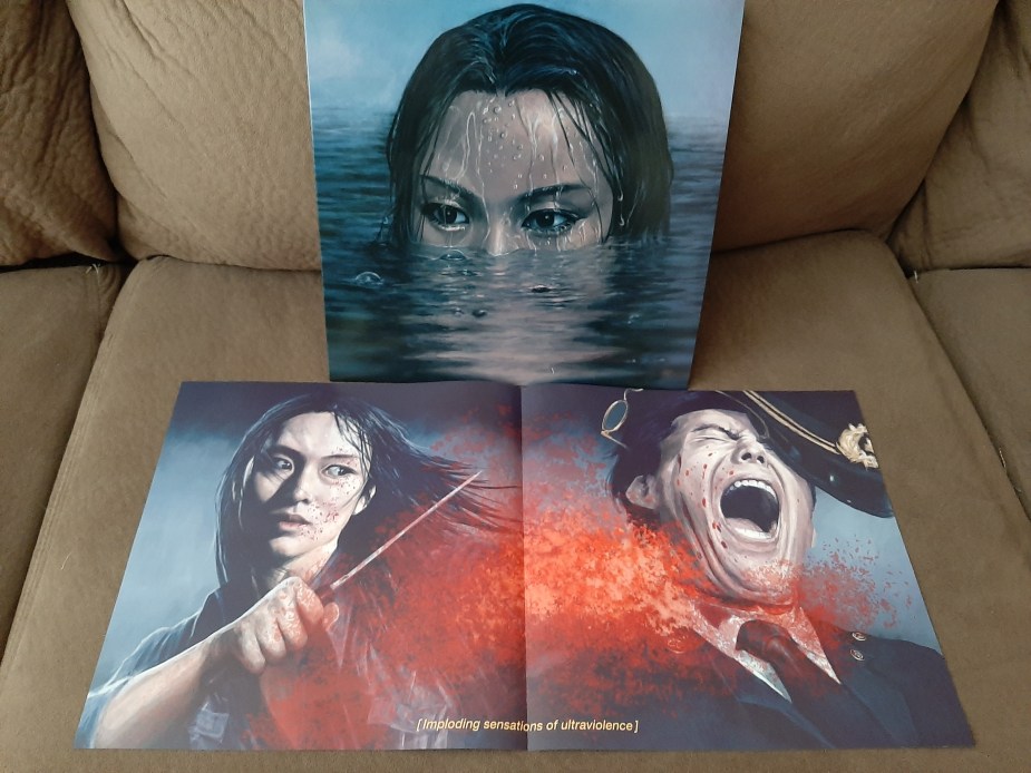
Wormrot’s final album for the band in its current form threw listeners several curveballs, including clean viking-style vocals and violins, among others. The dramatic shift in approach to cover art probably should’ve been received as a warning for what secrets lay beneath. The band’s previous three full-lengths all utilized primarily black and white, deformed faces to draw in listeners. Hiss, however, shows no overt violence and gore on the front page. That scratchy chaotic pencil approach of old works for their raw unhinged grind but this crisp, frankly, beautiful image is a better fit for the cleaner sound they’ve achieved on their most diverse work to date.
A young woman slowly emerges from the water with her eyes on a target that presumably doesn’t know she’s there. Much like the Predator looking for Arnie, there are bad intentions in those eyes that emit cool comfort with her plan of attack. The detail in the water is immaculate as it drips off her forehead and shows a blurred reflection of her face in the ripples beneath. The subtle shading across the water to provide a sense of depth and movement shouldn’t be overlooked, nor should the quality work achieved to create a background of fog or steam.
This is a cover that invites curiosity and questions as to what this lady is up to. What makes it even better is you get your answer when you open the packaging to find a two-panel piece that’s only true destiny was for the gatefold. There you’ll find the explosion of gory violence you would expect from a grindcore band. Our protagonist has expertly slashed a cop’s throat in an explosion of red. The man is screaming with every facet of his being while the woman looks on with no emotion, knowing her task is complete. The image is captioned with “[imploding sensations of ultraviolence]” and there really is no better description for a band like Wormrot. [SPENCER HOTZ]
PETER MOHRBACHER

With 35 years of fantasy setting adorning their album art, Blind Guardian helped set much of the visual DNA of power metal. Some covers have been more successful than others ‒ think of how the early albums share that “1970s J.R.R. Tolkien calendars by the Brothers Hildebrandt” quality ‒ and some are At the Edge of Time. Never, however, have they had cover art like that which adorns The God Machine.
The piece is called “Gadreel, Angel of War,” and is part of Peter Mohrbacher’s Angelarium series. The most immediately striking aspect is the color palette, consisting almost entirely of grays and that almost shocking red. From the roots and trees to key parts of Gadreel and his weapon, the red is the life of the art, as if the image itself has a circulatory system. The composition also creates a sense of speed, starting of course with Gadreel’s running posture, but amplified through the downhill setting and how both Gadreel’s spines and spear slice right across the other directional lines of the page. The swiftness is implied, but it also feels like a legend caught perfectly in time. Gadreel exhibits both sinewy human qualities and an almost alienness (is it armor or skin or both?), while the perspective almost makes it hard to tell his size.

He might be the stature of an ordinary man, and he might be 40 feet tall. Regardless of height, his strength is obvious, as is his majestic lethality. Legends, swiftness, majesty, and strength; pretty perfect match for Blind Guardian.
The band didn’t stop there, as the various editions of the album contain several other Mohrbacher works in gatefolds, digipaks, on the records, and on alternate covers. They obviously liked what they saw in the Angelarium. They liked it so much they ditched the gold color for their logo and instead went with that glorious silver to better match the art.
And yes, it goes without saying that something closely resembling Gadreel killed me about 36 times in Elden Ring. [ZACH DUVALL]
SAPROPHIAL

Some bands work with particular imagery, palettes, or themes from album to album. Be it the power of almighty branding or just a neat way to tie everything together, it’s a practice that’s been proven effective time and again. Hammers Of Misfortune have largely ignored this approach, save for a slight parallel in theme to be argued in the vinyl edition of The August Engine and the cover for The Locust Years, but even that is enough of a stretch to endanger pulling a hamstring. Each album cover still reflects its respective work though–more serving in the music within than any external conscious branding.
The cover on Hammers’ latest, Overtaker, is a megalith. It’s massive landscape is just begging for a proper gatefold edition; the only tragedy of which would be putting a crease right down the middle of the piece. Saprophial’s highly detailed pen and ink work breathes life into an abstract extraterrestrial being that swims through the atmosphere of a Venusian planet with the massive grace of a humpback whale. Note the fine horizontal lines in the foreground, subtly making the beast pop against its surroundings. The digitized color radiates, seemingly giving off its own glow from the setting alien sun. The darker hue around the flaming ball giving way to lighter hues as it expands outward makes the chemical sheen in the sky feel as though it is eternally in motion.
Not only does the beauty of the Overtaker cover beg for a listen of the music within, but it enriches the experience. Much like the beast on the cover, Hammers move with strange but fluid mechanics. Each part feels not entirely unfamiliar when its viewed through a microscope, but it’s the way the songs (or pieces of the creature on the cover) are put together that make the design itself so fascinating. Hammers and their creature twist, turn, glide, and soar as they explore the musical world of Overtaker with power, majesty, and grace, reflecting the masterful work of the cover for a glorious audio/visual payoff. [RYAN TYSINGER]
This might be my favorite year-end series, and Last Rites has definitely expanded my album art appreciation horizons.
It never hurts that the underlying tunes always rule too. Thanks, metal art nerds!!
Fantastic article and fantastic artwork. Powerslave and Somewhere in Time were formative for me in terms of not only their sound but what I expected from top tier heavy metal. Wonderful to see year after year of artwork in that same tradition.
Two of my favourites are the covers for Bekor Qilish’ and Vauruvã’s newest albums:
https://i-voidhangerrecords.bandcamp.com/album/throes-of-death-from-the-dreamed-nihilism
https://vauruva.bandcamp.com/album/por-n-s-da-ventania
Love the year end look at the cover art.
Two of my favourites for the year are both by Eliran Kantor
Venom Prison’s Erebos and Immolation’s Acts of God.
As you said RIP Mariusz Lewandowski. He is repsonsible for one of the most iconic cover in recent metal history with Bell Witch’s Mirror Reaper.